
This project is comprised of eight individual posters, with the goal of reflecting the mood and feeling from a single word or contrasting ideas. Each poster includes a typographic element that supports the overarching concept. I was challenged to use various Adobe Illustrator tools, honing my ability to learn and apply new skills. I made sure to make deliberate and consistent design decisions throughout each one to best represent the words I chose.
MYSTERY
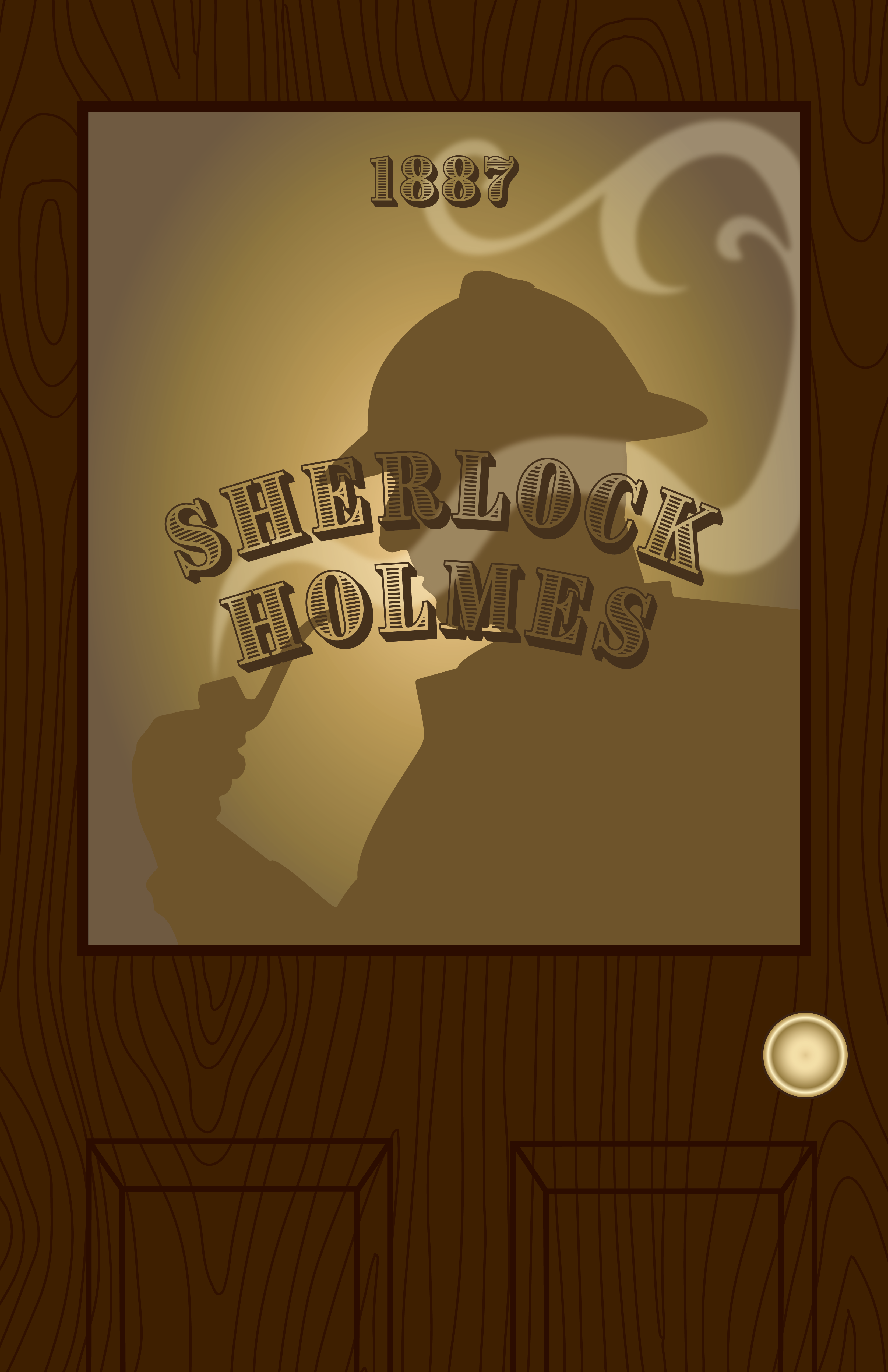
I chose to do a Sherlock Holmes inspired image, using a door with a frosted glass effect as well as a silhouette to create even more intrigue. I chose dark colors with a bright gradient in the back to highlight the figure further, making sure to also include his name and the year the story was published.
CALM
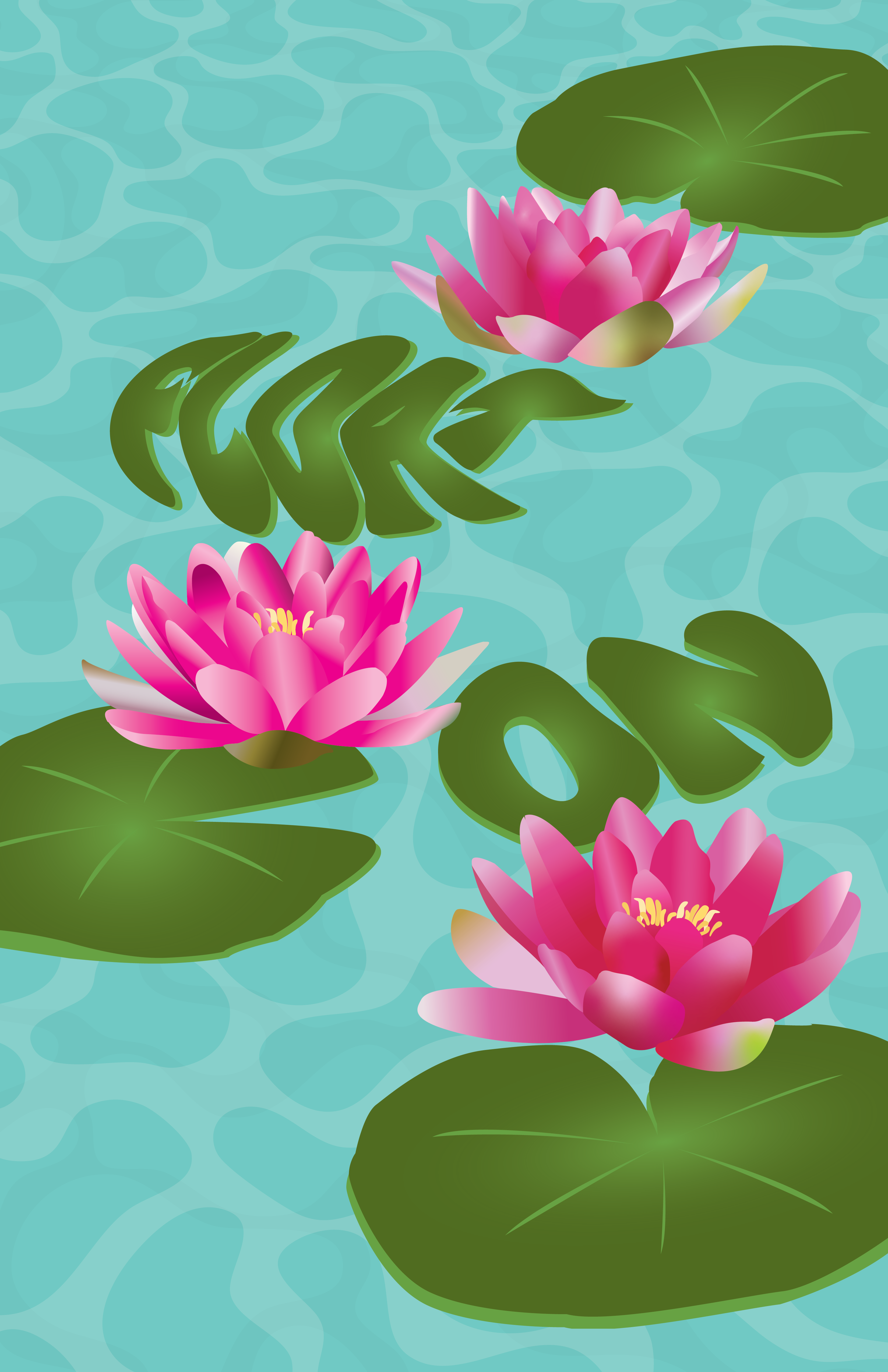
This poster includes lily pads on water because I feel like floating is a very good representation of the feeling of calmness. I chose to turn the words “Float On” into lily pads, using a soft font, and having this phrase as a reminder to keep moving fluidly and with a clear mind.
GROWTH
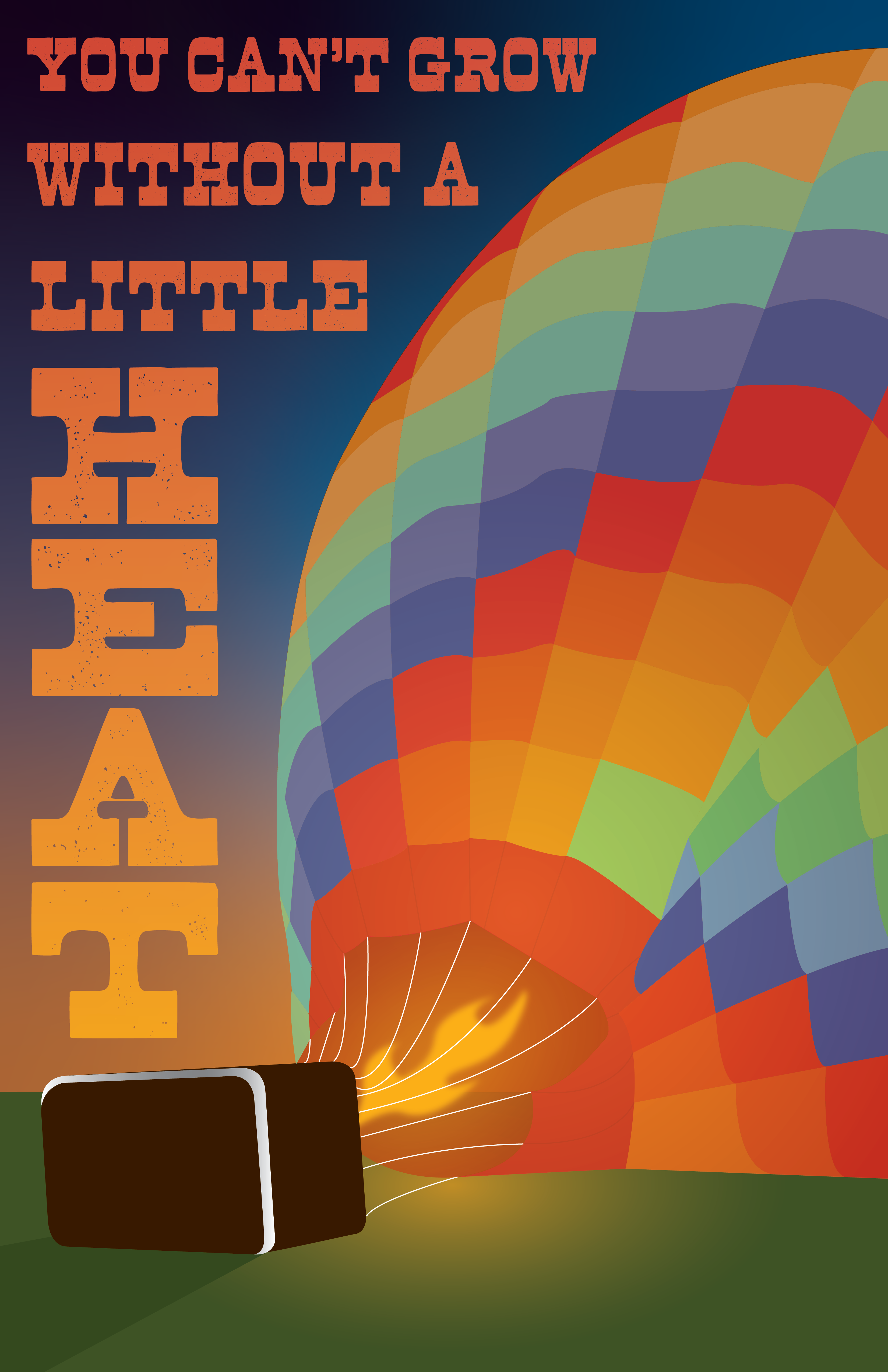
I was inspired by the various hot air balloon festivals happening around Colorado at the time. I wanted the quote I chose to have a double meaning, both referring to an actual hot air balloon, as well as personal development. I used gradients and Gaussian blur to achieve that glowing effect as well as the sunrise in the back, signifying a new day on the horizon.
CONNECTION
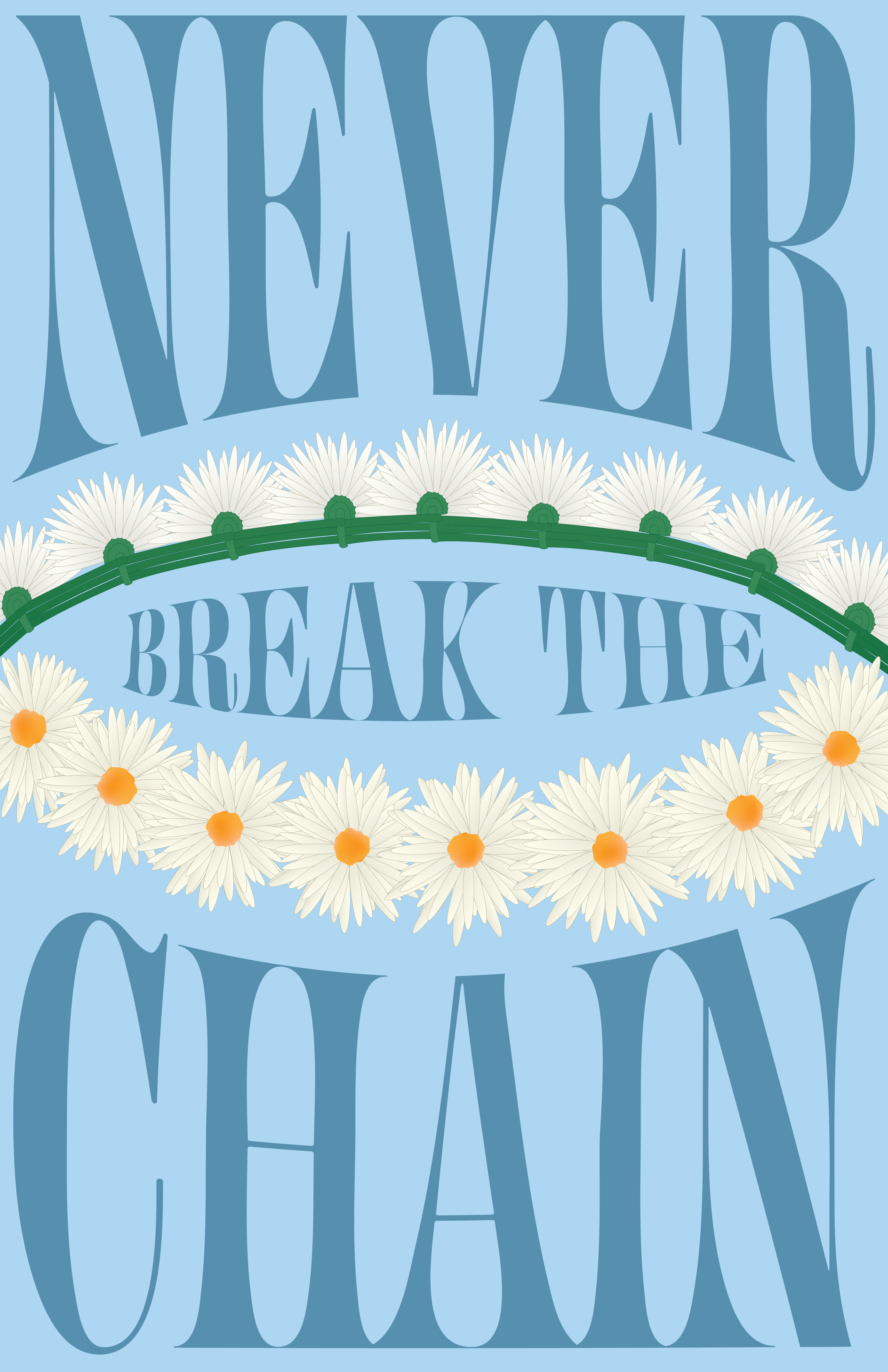
This poster represents connection through a daisy chain. I created each flower using a radial duplication technique and interlocked them with repeated stems. In order to fill the negative space, I utilized envelope distort, choosing a relevant Fleetwood Mac lyric to do so.
SMOOTH VS ROUGH
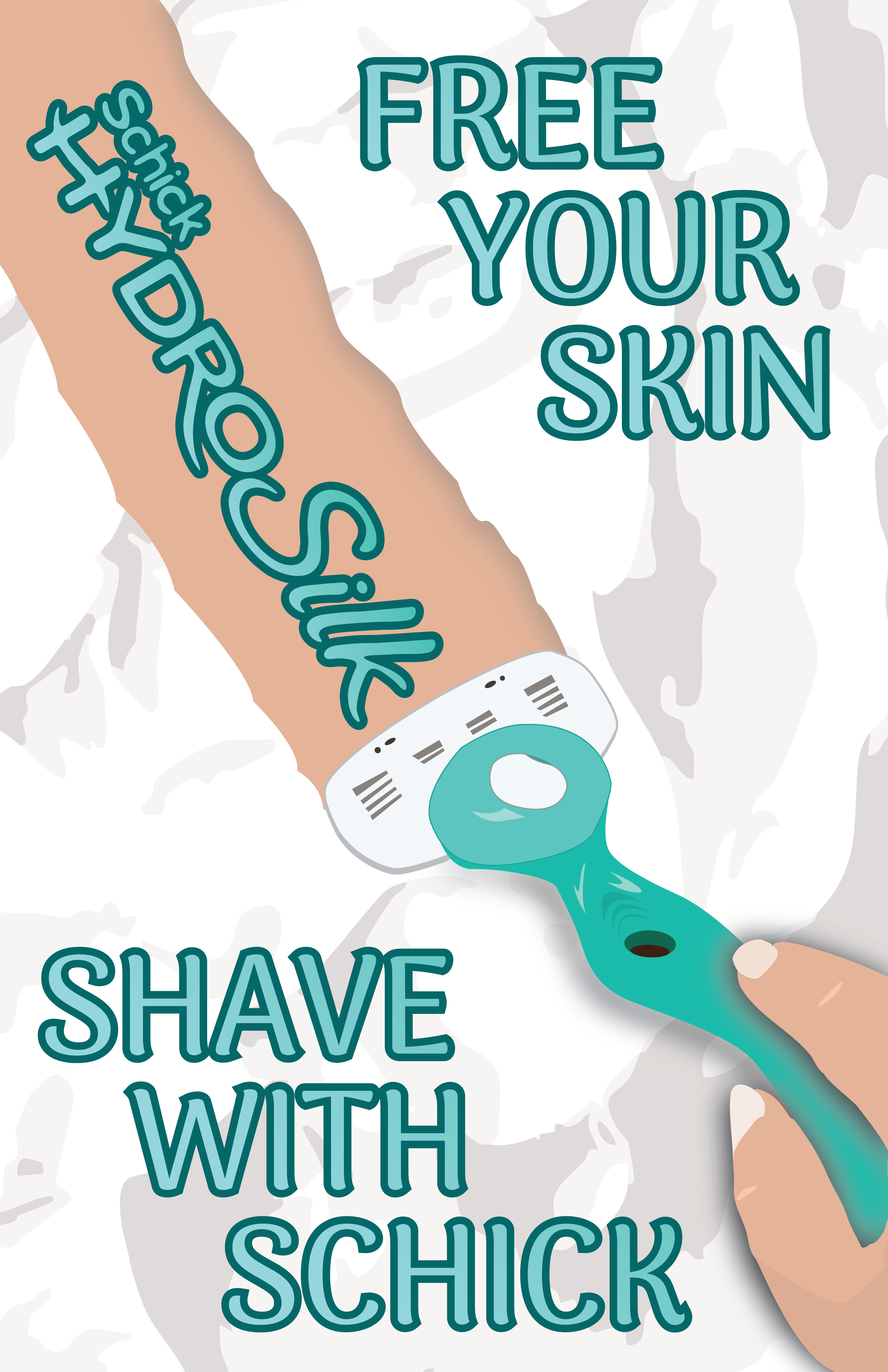
When I first saw this prompt, I immediately thought of shaving and the contrast of what it feels like before and after. I created a shaving ad where the product name was being revealed along the razor’s path, including a tagline to emphasize that feeling of softness.
LIGHT VS HEAVY
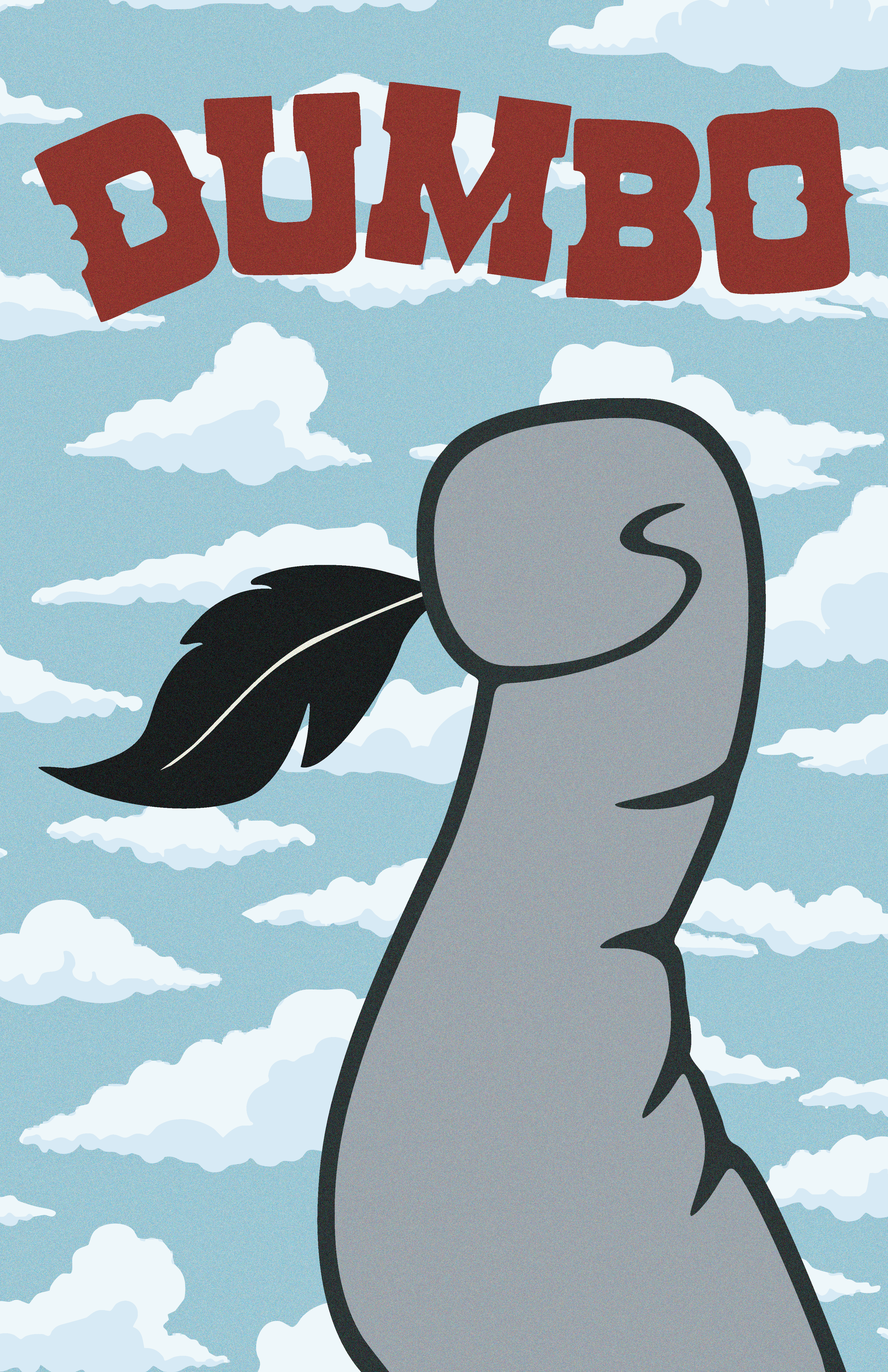
I chose to create a movie poster for Dumbo because I feel like the imagery of an elephant against a feather showcases this contrast very well. I wanted to focus on just his trunk to be able to see the feather clearly. I also added a grain effect to emulate a vintage feel.
EVENT
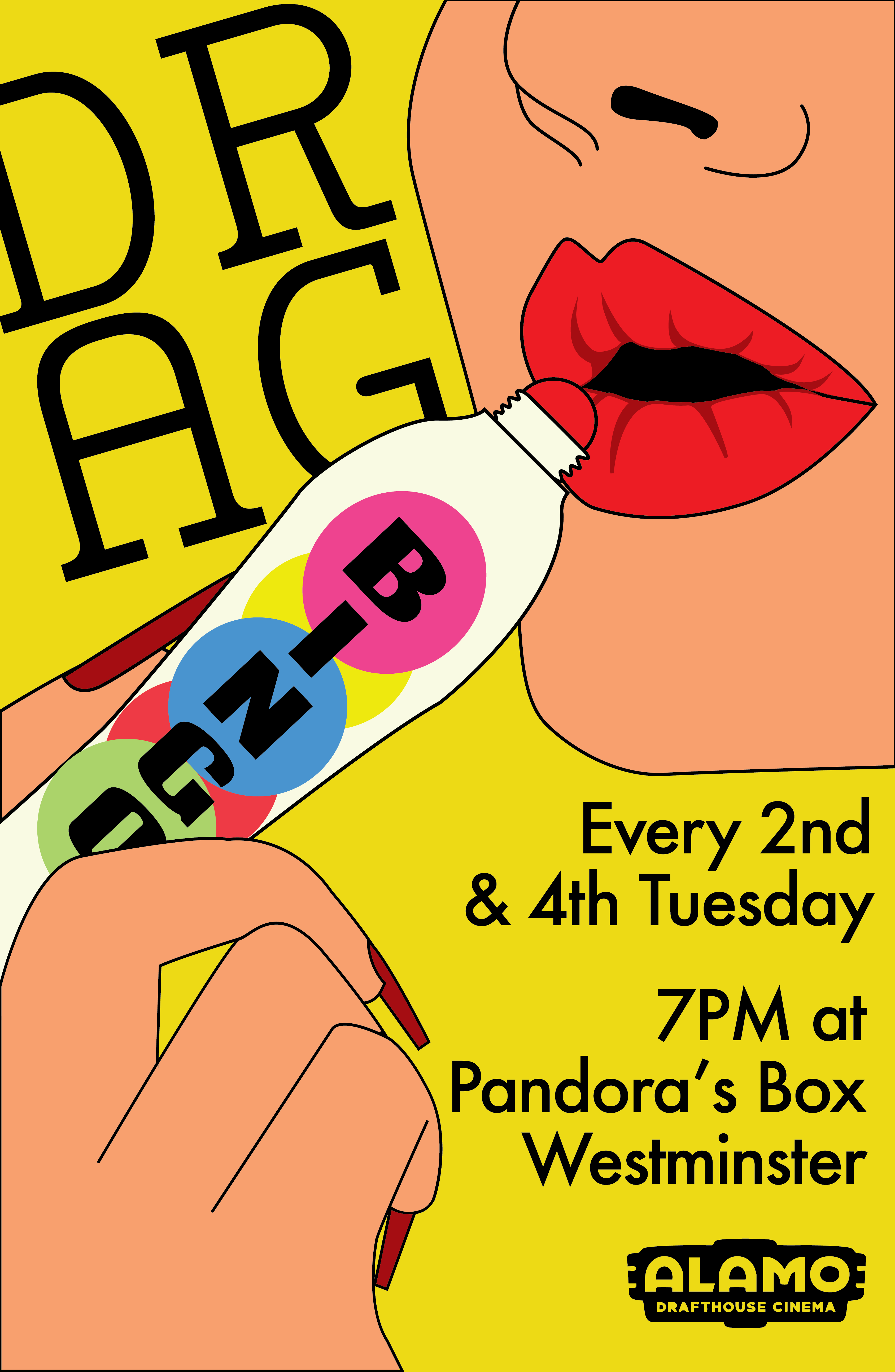
This is an event poster for a recurring drag bingo event at a local theater. I chose bright colors and the humorous imagery of a drag queen using the bingo dotter as lipstick. I wanted to give space for the information to be clearly shown, and I made sure that even though the words “Drag Bingo” weren’t in line, they were still legible and could be followed by the viewer.
ENTERTAINMENT
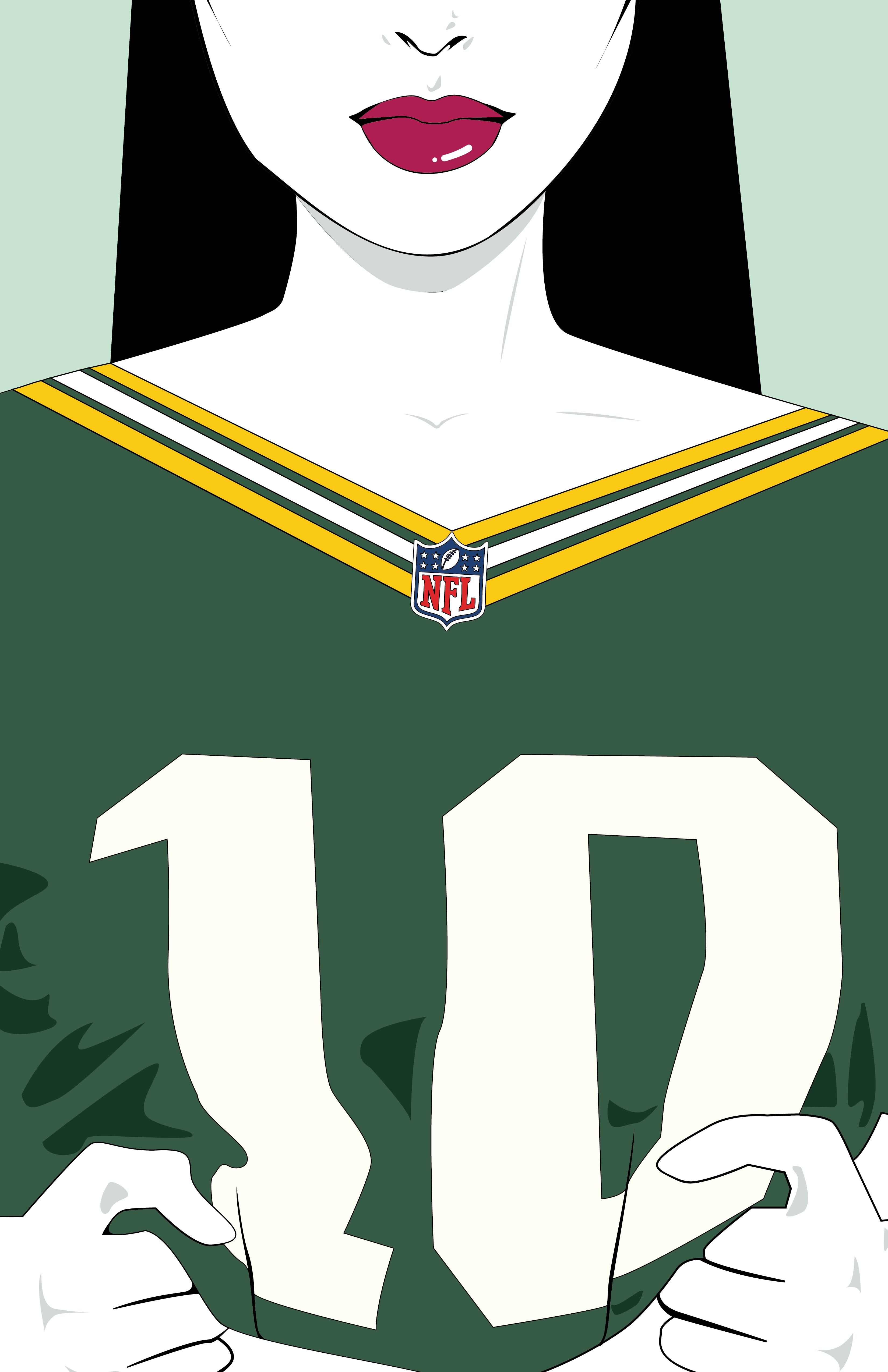
I made a Green Bay Packers poster inspired by the artist Patrick Nagel. I personally love Nagel’s work, so I wanted to try to imitate it while promoting the upcoming football season. I posed the model in a way that looks like she’s showcasing her jersey and made sure to place the NFL logo in a visible and central area.
